Start Right Learning Solutions
Building a Educational Brand That Bridges Trust and Imagination
Client
Anjana Thom, Founder
Timeline
7 Days (Rapid Sprint)
Scope Expansion
Logo → Cards → Full Brand System
Result
Role
Role
Tools
Adobe Illustrator, Photoshop, Canva
The Problem Space
The Real Obstacle
Anjana Thom founded Start Right to deliver premium tutoring and early childhood development across an 11-year age span (4–15). She had the pedagogy and track record. But she was losing deals.
Without a visual identity, parents, the actual buyers—couldn’t tell her apart from budget tutoring services. She was trapped competing on price instead of value. The math was brutal: perceived credibility directly determines pricing power.
She needed to shift perception from “homework help” to “educational accelerator.” In one week.
She needed to shift perception from "homework help" to "educational accelerator." In one week.
The Gap
A founder with proven expertise but no visual system to communicate trust to protective parents. The business was losing deals before conversations started.
What She Asked For vs. What She Needed
Initial brief: “I need a logo and business cards.”
Real problem: A scalable brand system that works across signage, learning materials, merchandise, every touchpoint where parents and students encounter the brand. Something that feels academically credible to parents but visually engaging to kids ages 4–15, and within the budget.
The Initial Direction
From Logo to Business Cards (How the Scope Changed)
The ask: Logo only.
I started by understanding the actual problem, not just executing the brief. She requested pencils, puzzles, and bright colors. But I needed to know why. What does learning actually mean to your brand? It’s collaborative. It’s building something. It requires guidance.
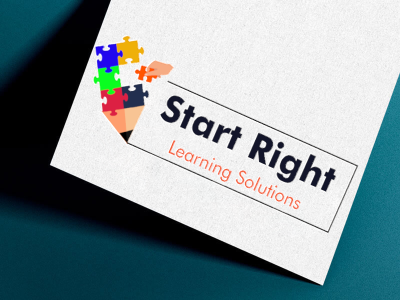
Core concept: A helping hand placing a puzzle piece, mentorship in visual form. The pencil becomes geometric building blocks. The pencil stroke extends as a foundation line beneath the brand name.
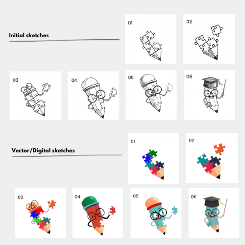
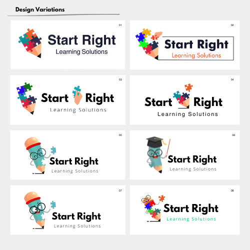
Initial concept: From strategic metaphor to multiple design explorations
The Visualization Moment
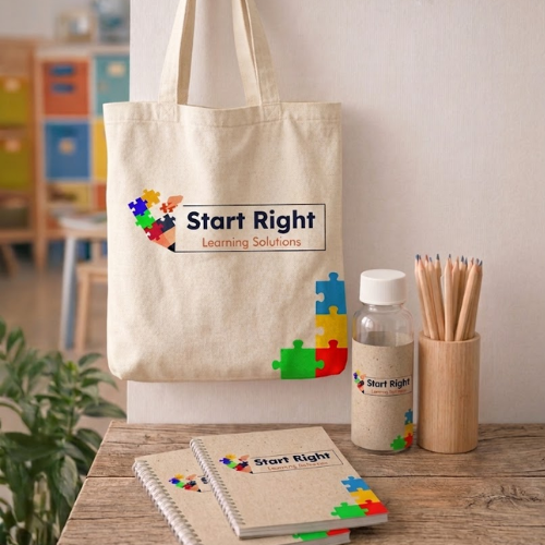
I created mockups of the logo in real contexts, not just as a static mark, but living on signage, on learning materials, on branded totes. I showed Anjana what the logo could become.
The shift: Logo in mockups → Brand system becomes visible
The Scope Pivot
After seeing the mockups, Anjana realized something: A logo alone wasn’t enough. She could see how the mark would appear on signage, how it could live on branded materials, how parents would encounter it repeatedly. She understood what a cohesive system could do for her positioning.
Her ask shifted from “I need a logo” to “I need business cards too—and I want every touchpoint to feel this intentional.” Scope expanded because she could suddenly see the opportunity.
This is why showing work matters: Mockups change minds. Anjana didn’t ask for more because the brief changed. She asked for more because she could see what the system could do for her business.
Business Cards: The Anchor Piece
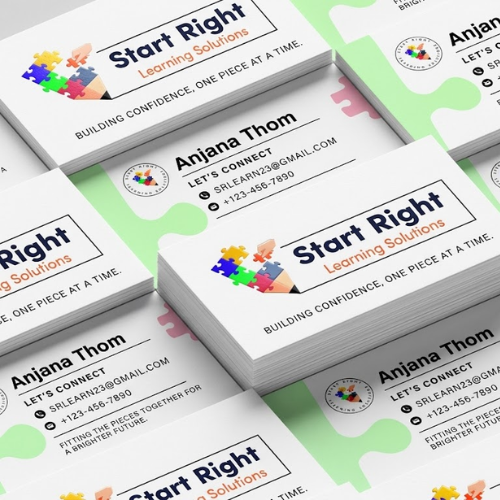
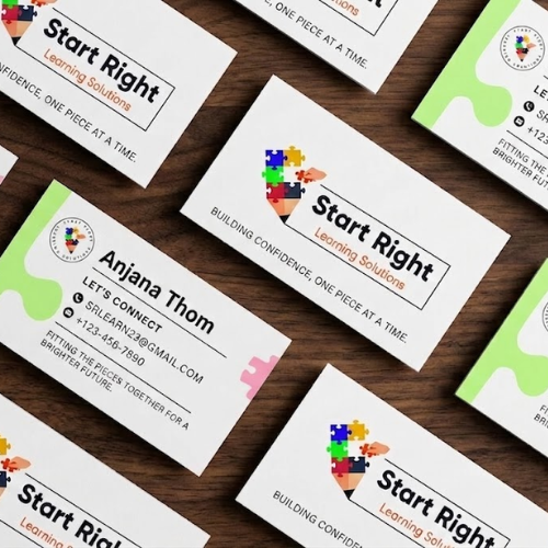
Once she decided on business cards, the system became real. Clean white field, generous whitespace, pencil stroke framing the contact details. Bright accent color on the back. Premium finish. These weren’t afterthought cards—they were the physical proof of the brand strategy.
Real-World Deployment
The logo didn’t just sit on a card. It lived everywhere. When parents saw the brand on signage, on tote bags their kids carried home, on learning materials, the consistency built trust unconsciously.
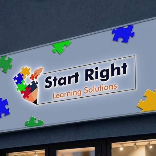
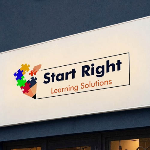
Anjana’s exterior signage now stops foot traffic. The brand reads as coherent, professional, established. Not a scrappy tutoring service. An educational brand ready to scale.
Business cards: Where strategy becomes tangible. Premium design, strategic whitespace, intentional color blocking
Logo at scale: From concept to building signage.