Labourly — Redesigning the hiring experience
Labourly is a B2B SaaS platform built to match qualified workers to jobs by tracking certifications, documents, and licensing. I led the end-to-end redesign of the job board and its entire connected ecosystem, working across all three user types on the platform: HR managers, candidates, and clients. The goal was to reduce friction, surface the right information at the right moment, and give every user a faster, more confident experience.
ROLE
UX/UI Designer — solo, end-to-end
COMPANY
Resonant Solutions — Labourly product
TOOLS
Figma, FigJam, Adobe XD
PLATFORMS
Desktop, Tablet, Mobile
Too many clicks, too many systems, not enough context
The original job board was functional but inefficient. HR managers had to jump between multiple screens, sometimes multiple systems — just to review a candidate against a job. There was no way to see a candidate profile and job description side by side. Critical job information was missing or buried. The ATS matching engine existed but its results weren’t visible without drilling into individual profiles.
The result was a slow, fragmented hiring process — the opposite of what Labourly was built for.
01
No side-by-side view — switching back and forth between candidate and job manually
02
Match percentage buried in profiles — no at-a-glance read on candidate fit
03
Job post list missing key info — no fill date, start date, hire type, or creator
04
No Move forward feature, Stage changes required opening full profiles — no quick action from the candidate list.
Three users, one platform — all under one redesign
The original job board was functional but inefficient. HR managers had to jump between multiple screens, sometimes multiple systems — just to review a candidate against a job. There was no way to see a candidate profile and job description side by side. Critical job information was missing or buried. The ATS matching engine existed but its results weren’t visible without drilling into individual profiles.
The result was a slow, fragmented hiring process — the opposite of what Labourly was built for.
HR managers
Candidates
Clients
The changes highlighted in this case study focus on the core hiring workflow. The full scope extended across every screen each user interacts with documents, certifications, tags, settings, messages, and the all-candidates view — all redesigned to support and reflect the same experience.
Watching real users do real work
Before any design decision was made, I needed to understand where the platform was actually breaking down, not from assumptions, but from observation. I ran contextual sessions with HR managers and clients over video calls with screen sharing, watching them use the existing platform as they completed their actual day-to-day tasks.
Situation
The platform had been in active use but the team had limited visibility into where users were struggling. There was no clear picture of what was slowing the hiring process down from the user’s perspective.
Task
My goal was to identify the real friction points before touching any design, to make sure the redesign solved actual problems, not assumed ones. I needed to understand what HR managers and clients needed to see, and when, to make confident hiring decisions faster.
Action
I connected with HR managers and clients and observed them using the platform live over screen sharing sessions. I didn’t ask them to describe problems, I watched them work through real tasks and noted where they hesitated, where they switched tabs, where they had to click more than once to find something they clearly expected to be right in front of them.
Result
Every core problem in this redesign came directly from those sessions. Watching real users work helped me understand where the platform was getting in their way, and gave me the clarity to simplify what mattered most.
What came out of those sessions shaped the entire direction of the redesign:
HR managers needed candidate fit information like match percentage, document status, and tag alignment,visible on the list without opening individual profiles
Critical job details like fill date, start date, and hire type were absent from listings — forcing HR to dig before they could even assess urgency
Clients couldn't see where a job stood or which candidates were in consideration — they had to ask HR directly
The number of clicks to make a single hiring decision was the most consistent frustration across both user types
These weren't edge cases, they were the core of what made hiring on Labourly feel harder than it needed to be. Every design decision that followed was a direct response to what users showed me in those sessions.
What changed and why
Match percentage surfaced on the candidate list
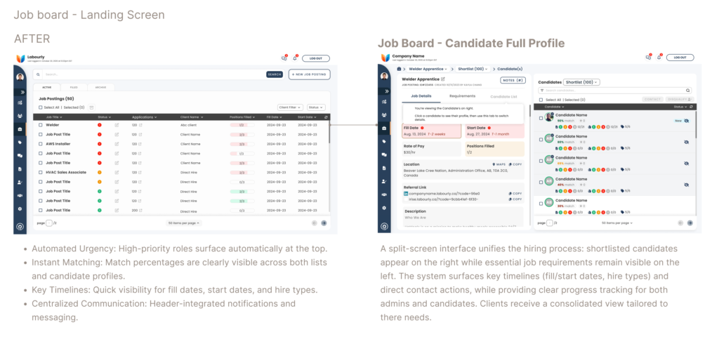
The ATS system matches candidates based on documents, certifications, and tags against a job's requirements. Previously this score was buried in individual profiles. Moving it to the candidate list card gives HR managers an at-a-glance read on fit — no extra clicks. The same score appears prominently on the full candidate profile for consistency.
Urgent roles surface first in the ATS list
The original list used generic ordering. Since Labourly's purpose is fast, qualified hiring, positions approaching their fill date now appear at the top automatically. The most time-sensitive roles get attention first — without anyone needing to know to filter for them. Filters remain available for teams who want a different view.
Job details redesigned to communicate at a glance
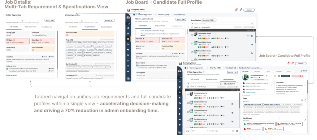
The previous job detail view was generic — no fill date, start date, hire type, or creator. The redesign adds all of this with colour used intentionally on date fields to signal urgency. A role approaching its fill date gets a warm treatment; one with comfortable runway stays neutral. No more mentally calculating urgency from raw dates.
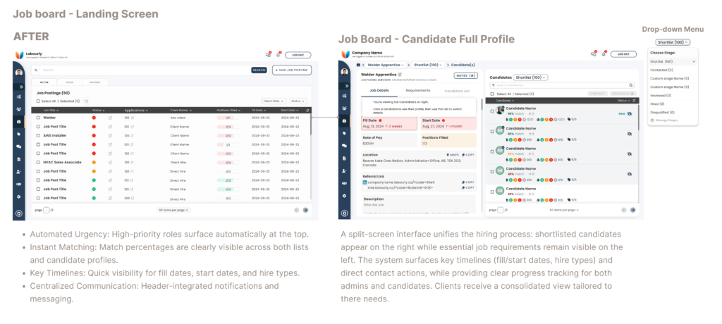
Custom hiring stages and "Change stage" from list and profile
HR teams can now create their own stages to match how they actually hire. A "Change stage" action is available directly on the candidate list and the full candidate profile — no drilling in just to move someone forward. I designed the complete flow for how stage changes work, including how they reflect on the candidate's side.
Redesigned top header — less space, more signal
The updated header introduces a notifications bell and messages indicator so important alerts are visible without navigating away. Reducing the top bar's footprint gives more vertical space to the screens that matter — the job board, candidate lists, and profiles.
Every connected page updated in service of the core flow
Documents, certifications, tags, settings, client messages, and the all-candidates view were all redesigned alongside the job board. Each of these feeds directly into how the ATS system works and how candidates and clients experience the platform — simplifying them was essential to making the overall experience feel cohesive rather than patched together.
What changed and why
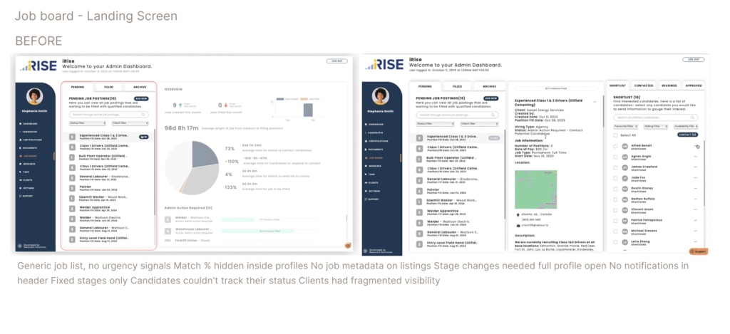
Before
Generic job list, no urgency signals Match % hidden inside profiles No job metadata on listings Stage changes needed full profile open No notifications in header Fixed stages only Candidates couldn't track their status Clients had fragmented visibility
After
Urgent roles surface automatically Match % visible on list and profile Fill date, start date, hire type, creator shown "Change stage" on list and profile Notifications and messages in header Custom stages per team workflow Candidates see stage progress clearly Clients have consolidated job and candidate view
Candidate list — match % visible on card, "Change stage" action shown inline in custom stages through dropdown menu.
Job detail redesign — fill date, start date, hire type with colour urgency treatment
The changes highlighted in this case study focus on the core hiring workflow. The full scope extended across every screen each user interacts with documents, certifications, tags, settings, messages, and the all-candidates view — all redesigned to support and reflect the same experience.
A faster, clearer experience across the board
Fewer clicks to decision Key fit information visible without opening individual profiles
Urgency made visible Time-sensitive roles surface automatically — no manual filtering
Hiring stages owned by the team Custom stages replace a generic flow that didn't reflect real hiring
Candidates informed, not guessing Stage progress visible on their side — less back-and-forth
Clients with full visibility Job tracking and candidate progress consolidated in one view
Cohesive system Every connected page updated — the whole thing holds together
What I took from this
The changes documented here represent the core hiring workflow — but the redesign touched far more. Every screen a candidate interacted with, every view a client used to track progress, every connected page that fed into the job board was reviewed and updated as part of this work. Being the only designer across all three user types simultaneously meant every decision had to hold up from multiple angles before it landed anywhere.
The biggest lesson was about restraint and leverage. The ATS match score, urgency ordering, and stage changes weren’t new features — the logic already existed in the platform. The design just wasn’t working with it. Surfacing what was already there, in the right place, at the right moment, moved the needle more than building anything new would have.
Good systems design isn’t always visible in a single screen. It shows up in how the whole thing holds together — and how naturally each user, whether HR manager, candidate, or client, can do what they came to do without thinking about it.